Selecting the right colors for the walls in your home is one of the most challenging tasks when redesigning your interior. A well-chosen wall color significantly contributes to the overall look of a room. The choice of colors in your home should not be left to chance or current mood; instead, when selecting colors, you must coordinate the wall color with the furniture, the purpose of the room you’re decorating, and perhaps align it with your favorite color.
Remember that any furniture you buy later should also match the colors you choose.
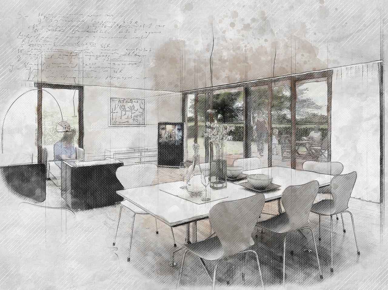
Colors for the living room
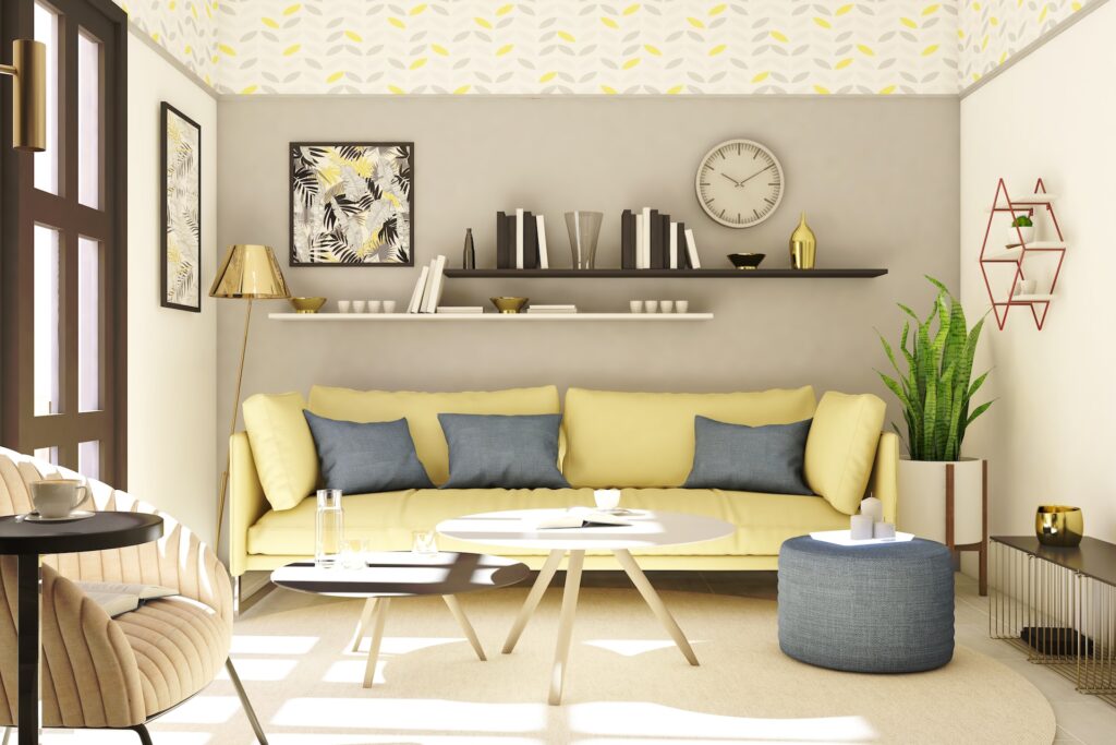
The living room is the space where you spend the most time. You can experiment with colors here, but keep in mind not to create too much contrast between furniture and walls. The best choice for living room colors are pastel shades. In recent years, using photo wallpapers and wall stickers has become quite popular. If using photo wallpapers, choose just one wall in the room, while the others remain solid and coordinated with the dominant color on the wallpapers.
Colors for the kitchen
Opt for pleasant colors in the kitchen and dining area to make food preparation and consumption more enjoyable. Besides matching the color of the kitchen elements, the wall color in the kitchen should also harmonize with the color of tiles or protective glass, which are essential parts of every kitchen. Light, gentle, and warm tones work best for the kitchen. Avoid using cold shades of gray and blue in this part of the house, as they can diminish appetite.
Colors for the bedroom
The bedroom is a place for relaxation and rest, so the wall colors should align with the purpose of this room in the house. The best colors for bedroom walls are blue, purple, gray, or beige. The neutral shades of these colors will help you fall asleep more easily. Avoid using orange and red on bedroom walls, as they can be stimulating.
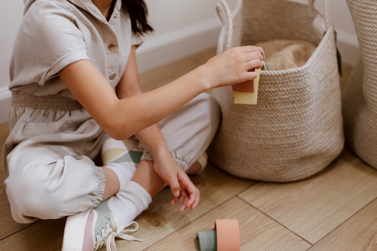
Colors for the kids’ room
The walls of a kids’ room can be painted in various colors. The colors should be vibrant but not overly bright or fluorescent, as they might induce aggression in children. If decorating a baby’s room, opt for lighter and softer colors, including pastel shades. For each wall in a kids’ room, you can choose a different color or even apply two different, often contrasting colors on the same wall. Make the walls of the kids’ room more interesting with the use of wall stickers.
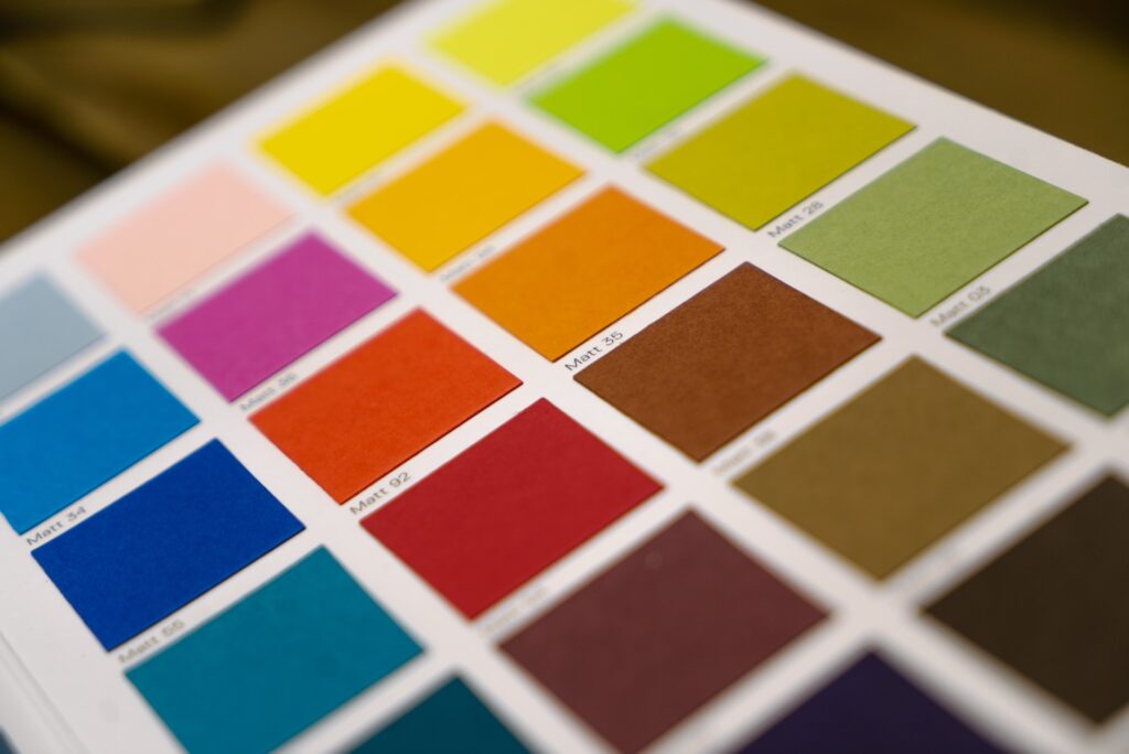
Choosing colors
Start with the color wheel – it includes primary, secondary, and tertiary colors.
Primary colors are red, blue, and yellow. They are pure colors and cannot be created by mixing other colors. Secondary colors are orange, green, and purple. These colors are a combination of two equal parts of primary colors. For example, equal parts of blue and yellow create green. Tertiary colors are mixtures of different proportions of primary and secondary colors, creating various shades. White and black are often added to these combinations to achieve lighter or darker desired shades.
Create your color scheme
Use the color wheel to create a scheme that best suits your personality. There are four types of possible color schemes:
Harmonious schemes – all colors in this scheme are harmonious and do not compete with each other. No color demands special attention, creating a calming atmosphere. There are two basic types of harmonious schemes.
Single color scheme – includes one low-intensity color, such as light beige, light gray, or white, within a limited value range. This scheme is often used in exhibition spaces as its calmness creates a perfect background. Any bright or eye-catching element introduced into this scheme will draw attention, breaking the monotony – this can be advantageous if you want something to stand out.
Monochromatic scheme – consists of one color in a broader range of values and intensities than the monochromatic scheme. For example, a scheme based on yellow could include light yellow, lemon yellow, and golden yellow, which can be used individually or in combination. A monochromatic scheme makes the entire space unique.
Contrasting schemes – unlike harmonious schemes, contrasting schemes exist to draw attention. Here, color is not accidental but serves as the focal point. There are several effective types of contrasting schemes. For starters, you can achieve contrast by using analogous colors, which means combining colors like blue and turquoise (blue-green) that are next to each other on the color wheel. Sometimes analogous colors won’t provide too much contrast and will resemble harmonious schemes more.
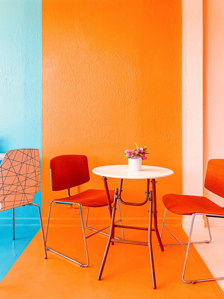
Another way is to use two complementary colors opposite each other on the wheel, like blue and orange, or you can even combine blue with shades of orange, or vice versa. By introducing more colors, you can create contrasts with triadic combinations, where you expand the entire scale with additional shades of each color in the triad composition. Furthermore, beautiful and harmonious contrasts can be achieved using warm and cold colors. You can further expand the range by incorporating different patterns and materials, but that’s a topic for another time.
Applying your chosen color palette
Be cautious when selecting wall colors – they are inexpensive and can be done in any color and shade you desire. Therefore, when decorating a room, it’s best to start with items such as furniture and carpets, which are harder to decide on and more expensive. Once you’ve chosen your furniture, you can then pick the wall colors.
You can decide whether you’d rather apply your colors to accessories and furniture or to the walls. Many people prefer the former. On the other hand, some choose neutral furniture while opting for bold and intense wall colors.
Four most common mistakes when choosing colors
Colors are a crucial decorative element when it comes to interior design, greatly influencing the coherence of style, beauty, and comfort in your home. Therefore, the selection of colors requires special attention, consultation with experts, and an additional investment of time to discover colors that will enhance your living space.
When choosing colors for furniture, walls, decorative elements, or the overall theme of your home, it’s easy to make mistakes. To help you avoid these pitfalls, here are some of the most frequent and typical errors:
Matching decorative color with dominant objects in the space
If you intend to highlight central elements in a room, such as the furniture in your living room, consider choosing decorations in the same color but with lighter and softer tones. Opting for a completely identical color scheme can create a closed-off feeling in the space, and what you wish to emphasize might remain unnoticed. For instance, when dealing with dark furniture, complement it with lighter shades of rugs, decorative cushions, curtains, and similar items.
Selecting inappropriate colors for the intended space
Warm colors have a positive impact on mood and enhance comfort, making them the ideal choice for living rooms. These encompass earthy shades of red, dusty purple, and deep gold tones. On the other hand, cool colors like silvery blue, natural green, and lavender have a calming effect, making them an excellent fit for bedrooms.
However, using green on bathroom walls or employing bright yellow tones in a bedroom might lead to irritation. Therefore, it’s advisable to carefully consider the emotions you want to evoke and the ambiance you intend to create in a specific area.
Disregarding the harmony of colors
Color harmony is key to achieving a visually pleasing and balanced space. While experimentation is encouraged, it’s essential to ensure that the colors you choose complement and coexist harmoniously. Avoid overly contrasting colors that create visual chaos and confusion. Strive for a well-balanced palette that enhances the overall aesthetics.
Neglecting the impact of lighting
The lighting conditions in a room can significantly alter the way colors appear. Natural and artificial lighting can make colors appear warmer or cooler. Therefore, it’s crucial to assess how your chosen colors will interact with the available lighting in the space. Test your color choices under different lighting conditions to avoid unexpected color shifts.
In conclusion, the selection of colors plays a pivotal role in shaping the atmosphere of your living space. By avoiding these common mistakes and considering the emotional impact and functionality of each color, you can create a harmonious and visually appealing environment that resonates with your unique style and preferences.
For further insights, take a look at the following two videos that provide valuable guidance on color selection.